
How to Make Shopify Collection Pages Easier to Browse by Color
A practical field guide to choosing, setting up, and checking color swatches on Shopify collection pages without turning your catalog into a maze.

A collection page is supposed to help shoppers narrow a catalog. Yet color-heavy stores often make people open product after product just to discover whether an item comes in navy, clay, or olive. That is a browsing problem, not a design problem.
Color swatches on collection cards give shoppers a useful signal before the click. Done well, they make a broad grid feel like a small, navigable set of choices. Done badly, they create duplicate-looking cards, misleading colors, and a theme-level maintenance job nobody wants. This guide is a practical way to make the useful version.

Start With the Catalog Decision, Not the Swatch Style
Before changing a collection grid, decide what a color represents in your catalog. There are two clean patterns.
Use variants when the item is materially the same product: same description, same fit, same price logic, and mostly the same imagery. One product page can carry the colors, and a swatch simply switches that option. This keeps reviews, inventory context, and product information in one place.
Use linked products when each colorway needs its own story. This is common when a color has a different photography set, a distinct product title, a different material, or a price that deserves its own page. The swatch should then take a shopper to the relevant sibling product rather than pretending it is a conventional variant.
That distinction matters more than the circle, square, or tooltip you choose. If your color structure is fuzzy, the collection page will faithfully expose the fuzziness. For a deeper setup walkthrough, see how to turn Shopify product variants into swatches that help shoppers decide.
Build a Small Swatch Vocabulary
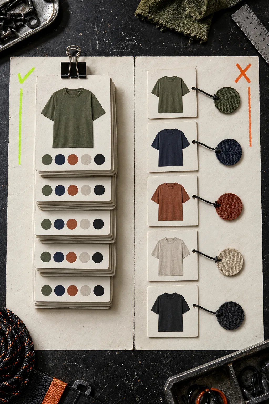
Do not start by importing every color label from suppliers. Start with the names shoppers actually use to choose. A store that calls three almost-identical blues “midnight,” “ink,” and “deep navy” may be technically accurate, but it makes a collection grid harder to scan.
Create a compact swatch vocabulary for each collection family:
- Keep the customer-facing label clear: Navy, Sand, Moss, Black.
- Use a real product image when texture or print is the decision, not just hue.
- Reserve a color chip for solid, reliably rendered colors.
- Decide whether unavailable colors remain visible and make the behavior consistent.
This is where Supra Swatch Colors is useful: it can turn built-in variant color options into swatches or connect separate product pages as a group, and it supports swatches on product and collection pages without theme-code surgery. It also lets you use color detection or product images to get an initial set built faster. The important word is initial: always check the result against the real product photography.
Make the Collection Card Earn Its Space
A collection card already has an image, title, price, badges, and sometimes a quick-add control. Swatches should help a choice, not become another dense row of UI. Put them where the eye can find them consistently, keep the size touch-friendly on mobile, and show a sensible limit before the row turns into confetti.
Test this with a deliberately mixed collection: a plain tee, a patterned shirt, a product with only two colors, and a linked-product group. If the same swatch treatment explains all four, you have a system. If it works only for the easy product, you have a demo.
The app offers more than 20 style options, so the temptation is to tune every detail. Resist it. Pick one shape, one size range, one label convention, and a single tooltip behavior. Your brand can still be recognizable without making every collection card a tiny art project. The earlier guide on turning collection pages into a color-first browse path is a useful companion for the merchandising side of this decision.
Check the States People Actually Encounter
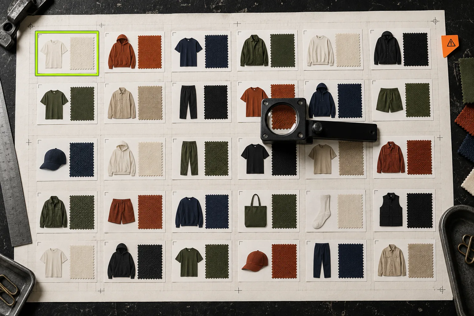
Previewing one product in the theme editor is not enough. Run a preflight across collection pages and real devices. I use this short checklist:
- Match color to image. Click every swatch on a sample of products. The selected color should either update the product image or clearly lead to the appropriate linked page.
- Check mobile wrapping. Open the busiest collection on a narrow screen. A neat desktop row can become a clipped or accidental two-line control on mobile.
- Check labels and tooltips. Keyboard and screen-reader users still need the color name; color alone is not a complete instruction.
- Check inventory behavior. Make sure sold-out colors follow your chosen rule. Surprise dead ends cost more than a small “sold out” hint.
- Check translated storefronts. If you sell in more than one language, verify the swatch labels and related product choices in each storefront language.

This QA pass is also a good moment to check your source images. If color accuracy depends on product photography, a poor image will undermine an otherwise sensible swatch. Choosing a first Shopify product for a lifestyle photo test has a useful way to select the first products worth improving, while a safer Shopify bulk price-change preflight is a reminder to make catalog-wide changes from a reviewable list rather than a hurry.
Roll Out in One Collection First
Do not convert the whole catalog on a Friday afternoon. Pick one collection with meaningful color choice and manageable inventory. Record the before state: a few screenshots, product-click behavior, and the number of color-related support questions or returns you already see. Then add swatches, test the preflight, and watch whether shoppers can reach the intended color in fewer clicks.
If that collection becomes easier to scan, repeat the pattern. If it becomes busier, simplify the vocabulary or move borderline products into linked groups. The goal is not more decoration. It is a collection page that answers “does this come in my color?” before a shopper has to ask.
Install Supra Swatch Colors, start with one collection, and use the results to set the rules for the rest of the catalog.