
How to Make Shopify Collection Pages Easier to Scan With Color Swatches
A practical workflow for choosing, setting up, and QA-checking Shopify color swatches on collection pages.

A collection page has one job before anything else: help a shopper narrow the field. When a store sells the same jacket in four colors, making someone open four product pages just to find olive is needless friction. Small color swatches turn that first pass into a fast visual decision.
The useful version is not a decoration bolted onto the theme. It is a small information system: each chip needs to mean the same thing, land on the right product, and remain clear on a busy collection grid. Here is the compact workflow I would use before rolling it across a Shopify catalog.

Start with the shopper’s choice
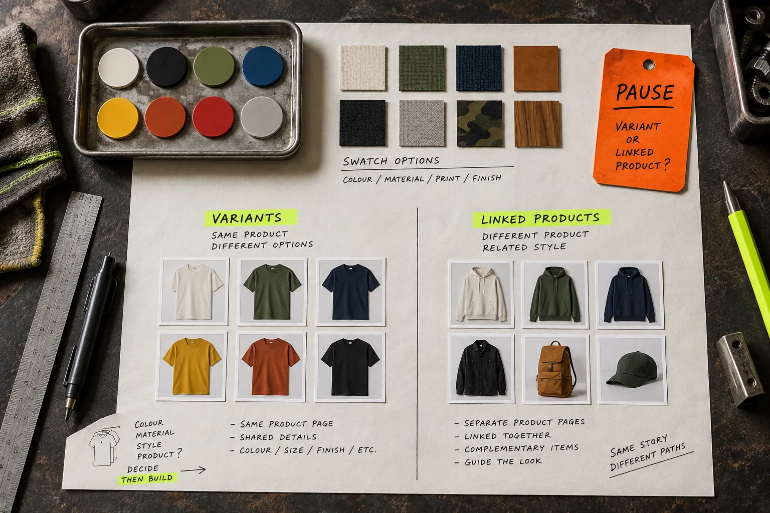
First, identify what the swatch represents. There are two common cases.
- A variant color: blue, black, and red are options on one product page. The swatch should select that option without sending the shopper elsewhere.
- A linked product: each color has its own product page, perhaps because inventory, images, or merchandising differ. The swatch should take the shopper to the matching product.
Do not make this decision from the color name alone. Open a handful of real listings and check the product data, imagery, inventory logic, and URL structure. A collection page that mixes the two behaviors is fine if it is intentional; it is confusing when two visually identical chips behave differently for accidental reasons.
This is the moment to clean weak labels too. If one family uses “Forest,” “Pine,” and “Green 03” for near-identical colors, a perfect swatch UI cannot rescue the catalog. Treat the visible color as shopper-facing information, not a leftover import field.
Use a small test set, not the whole collection
Pick six to ten products that cover the awkward cases: a simple variant product, a linked-product family, a product with image swatches, and a product with a long title or sale badge. Put them in a private test collection if possible. You are testing the visual system and the click path, not trying to finish catalog maintenance in one heroic afternoon.
I would check the collection page at the smallest common mobile width first. Swatches that look sensible under a roomy desktop card can wrap into a noisy second row on a phone. If the grid gets crowded, reduce the number of chips shown, choose a consistent size, or let the product image carry more of the decision. Never shrink the chips until color becomes a guessing game.
Set a few rules that survive new products
Write down three rules before configuration:
- Every color family gets one preferred shopper label.
- Solid colors use color chips; patterns, washes, and materials can use image swatches when color alone is ambiguous.
- A swatch must lead to a purchasable, correctly imaged choice.
Those rules prevent the classic slow decay: a nice launch setup that turns into mismatched circles, random images, and dead ends after the next catalog import. If you already use a product-page information system, the same principle applies there: keep one source of truth rather than manually correcting every description. For example, this guide on organizing Shopify product information with tabs and accordions is a good reminder that structure beats repeated edits.
For the implementation itself, Supra Swatch Colors is useful because it supports both variant swatches and linked-product swatches, including collection pages, without theme-code surgery. It can use detected store colors or product images, and its swatch styling can be tuned to the store instead of imposed on it. The product site is a sensible place to review the fit before adding it to a live theme.
Configure for recognition, not novelty
Use styling choices that help a shopper distinguish chips quickly:
- Give white, cream, and pale colors a visible outline.
- Keep the swatch shape and size consistent across product and collection pages.
- Use tooltips or labels where shades could be confused.
- Reserve image swatches for cases where a flat color would hide an important pattern or texture.
Avoid trying to communicate every merchandising detail inside the chip. It is not a miniature product card. Its job is to say “this is the color or finish you are looking for” and provide a predictable next click. If a team is already changing catalog taxonomy at scale, protect that foundation first; this bulk product-type QA guide has a useful caution about standardization before mass updates.
Run the collection-page QA pass
After configuration, test the same sample set in this order:
- On a collection page, tap every visible swatch and confirm the expected variant or linked product opens.
- Confirm the selected product image and color state agree.
- Check desktop, mobile, and at least one collection with filters or sale labels.
- Review a multilingual storefront if you run one; color labels and supporting copy should stay intelligible in each language.
- Repeat after publishing a new colorway or changing the theme.

The failure mode to watch is a plausible-looking grid that routes shoppers to the wrong item. A chip can be beautifully styled and still be operationally wrong. Keep the QA list short enough to run after every catalog change. The best routine is the one someone actually repeats.
Make the first browse faster
Color swatches earn their space when they help shoppers scan, compare, and reach a legitimate choice with fewer detours. Start with a small representative collection, decide which products use variants versus linked pages, and make the behavior consistent. Then scale the setup with confidence.
If your collection pages currently make shoppers open product after product just to find a color, install Supra Swatch Colors and test it on one collection this week. It is a small storefront improvement with an immediately visible payoff.
For related launch hygiene, pair this work with a Shopify product photo shot-list check: clearer product imagery makes image swatches more trustworthy. And if you later need to update supporting catalog tags, use a safe process like this bulk tag update guide, rather than treating the collection page as the only place product data needs care.