
How to Make Product Photo Backgrounds Consistent Without Faking the Product
Use a mask-first background workflow to make product photos consistent while keeping edges, shadows, color, and product details truthful.
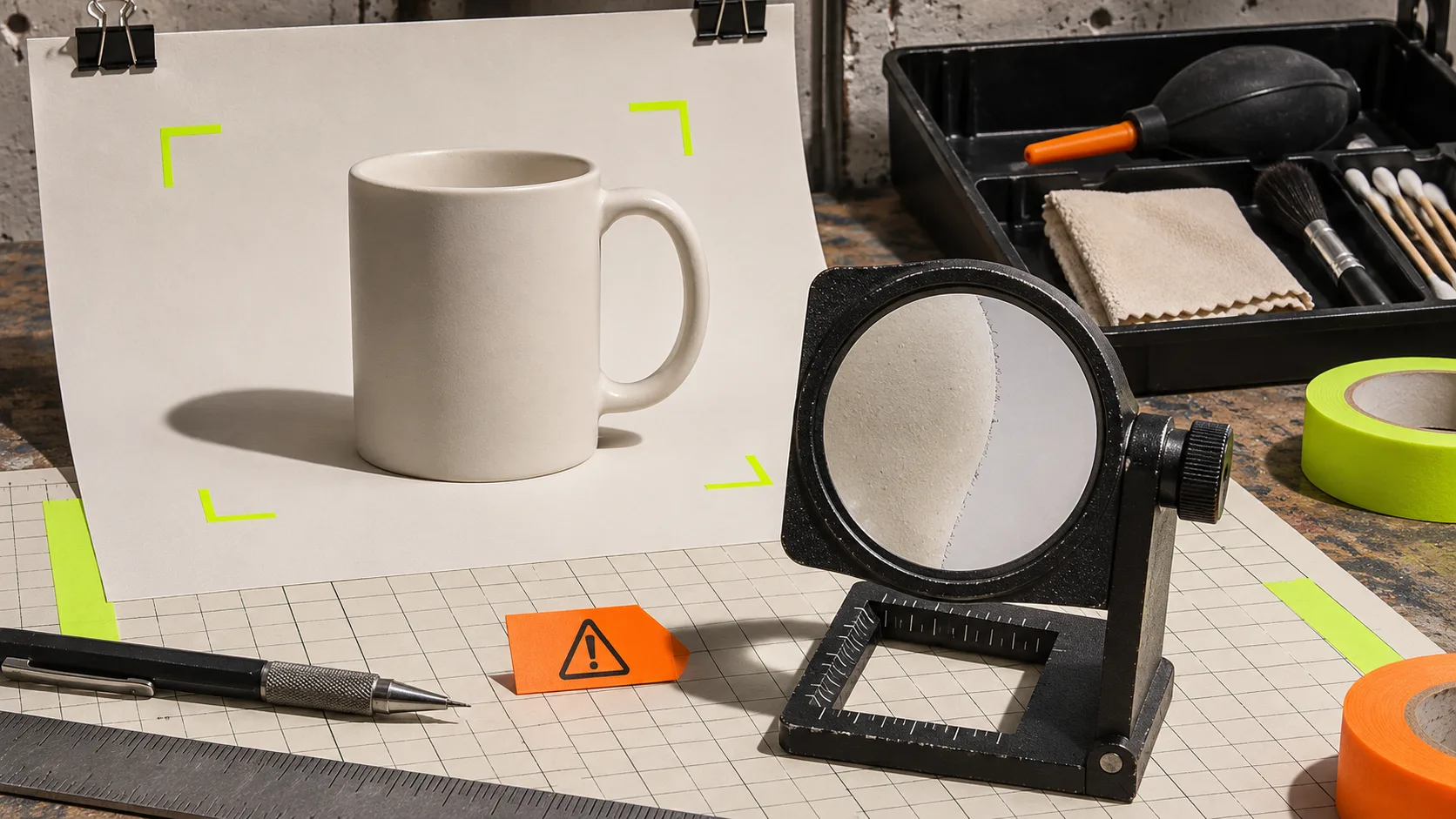
How to Make Product Photo Backgrounds Consistent Without Faking the Product
A consistent product-photo background should make a catalog easier to scan, not make the item look like something it is not. The safest route is mask-first: preserve the product pixels, change only the surrounding field, then review the edge, shadow, and color before export. ImageFlow is useful here because its browser editor gives you layers, masks, adjustment layers, and editable exports instead of asking a generative tool to redraw the product.
This is not a recipe for rescuing an unusable shot. A background swap cannot prove a texture, repair a missing reflection, or turn a dim image into honest studio photography. It can, however, make a sound source image fit the same visual system as the rest of a collection.
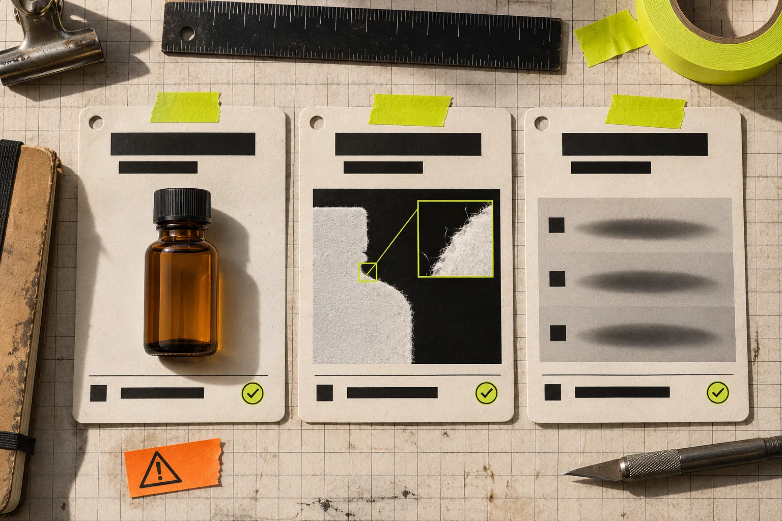
Start with a scope card, not the remove-background button
Before selecting anything, write four short lines for the image:
| Check | Question | Hold the edit when… |
|---|---|---|
| Product truth | What must not change? | A label, finish, included accessory, or edge detail is unclear. |
| Background job | What needs consistency? | You cannot name a simple background, crop, or shadow target. |
| Source quality | Does the original support the change? | The product is badly blurred, clipped, or hidden by a busy foreground. |
| Proof | How will you compare it? | You have no original or no second person who can inspect it. |
That card prevents a common failure: treating every uneven backdrop as an editing problem. Sometimes the correct answer is a reshoot, a different crop, or leaving the photo alone. It also works well with a four-file versioning system for reversible edits: keep the source, an editable working file, a review export, and the final delivery separate.
Build the edit in four reversible passes
1. Duplicate the source and keep the original visible
Open the source in ImageFlow, duplicate the working layer, and lock or hide the untouched copy. The point is not ceremony; it gives you a fast before/after comparison when a small change starts to alter the item. If a teammate supplied a PSD, ImageFlow lists PSD and PSB import/export alongside layers, masks, smart objects, and adjustment layers, but test your own complex production file before relying on a round trip.
2. Select the product, then inspect the mask at 100%
Use object selection or background removal to get a starting mask. Do not stop there. At full size, inspect the places shoppers use to judge quality: handles, glass, translucent plastic, seams, label corners, metal edges, and soft fibres. Paint or refine the mask instead of flattening the result.
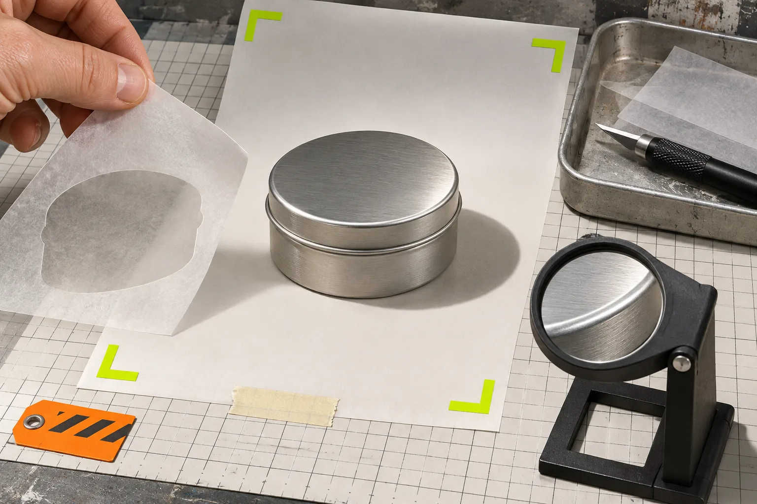
A clean silhouette is not always a truthful one. If the original has a soft contact shadow, preserve a plausible version of that shadow; do not cut the product loose so it appears to float. If the image contains a reflection that describes the material, do not erase it just because it complicates selection. For a related examination of editable visual elements, see this guide to building an editable product comparison graphic in your browser.
3. Add a neutral background on its own layer
Put a solid or gently graded background beneath the masked product. Keep it boring on purpose: a neutral sweep, a repeatable brand color, or a simple collection backdrop. The background should support comparison across products, not compete with texture or color.
Use an adjustment layer for minor exposure or white-balance correction if the source needs it. Avoid pushing product color until it merely matches the background. That is the threshold where catalog consistency becomes misleading.
4. Make a review export before the final export
Export a temporary review image and compare it beside the source on the same screen. Look at normal storefront size and at 100%. Check whether the object has changed shape, the label has lost detail, the shadow points in a nonsensical direction, or the background makes the product color read differently. Shopify’s product-media guidance is also a useful boundary: product media is public storefront material, so it should never contain confidential source files or private production notes.
Use a simple publish-or-hold decision
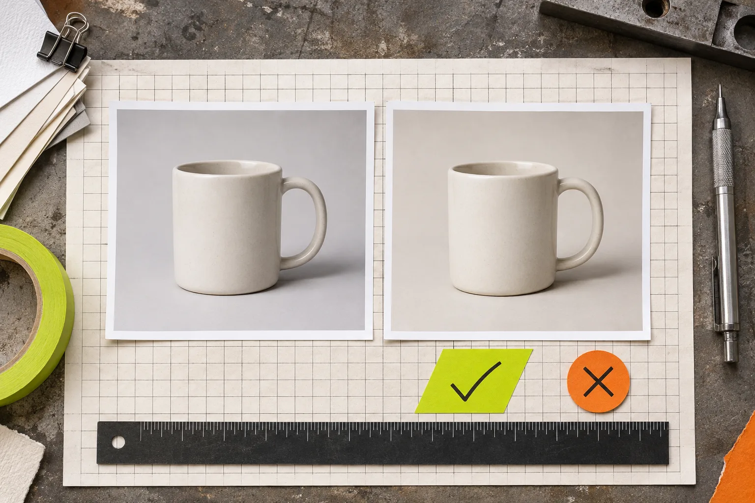
Publish the edit when all three statements are true:
- The product’s shape, material, color, branding, and included items still match the source.
- The mask edge and contact shadow look intentional at both zoom levels.
- The new background makes this image more consistent with the collection without making a claim the original cannot support.
Hold it when a difficult edge, glare, transparent material, or missing shadow changes how the product is understood. That is not a failure of the tool. It is a useful signal that the source photo needs a different treatment. The same practical check appears in this Spanish guide on cropping product photos without inventing details and this French pre-publication product-photo control sheet.
The smallest useful edit is usually the best one
Background consistency is a catalog decision, not a licence to manufacture better-looking products. Start with one real image in ImageFlow, keep the source layer intact, and change only the background that is preventing a clear comparison. If the proof view still feels honest, export it. If it does not, keep the original and fix the photo setup instead.