
How to Make Shopify Size Charts Easy to Read on Mobile
A practical mobile-first checklist for Shopify size charts: readable measurements, clear fit guidance, and catalog-wide consistency.
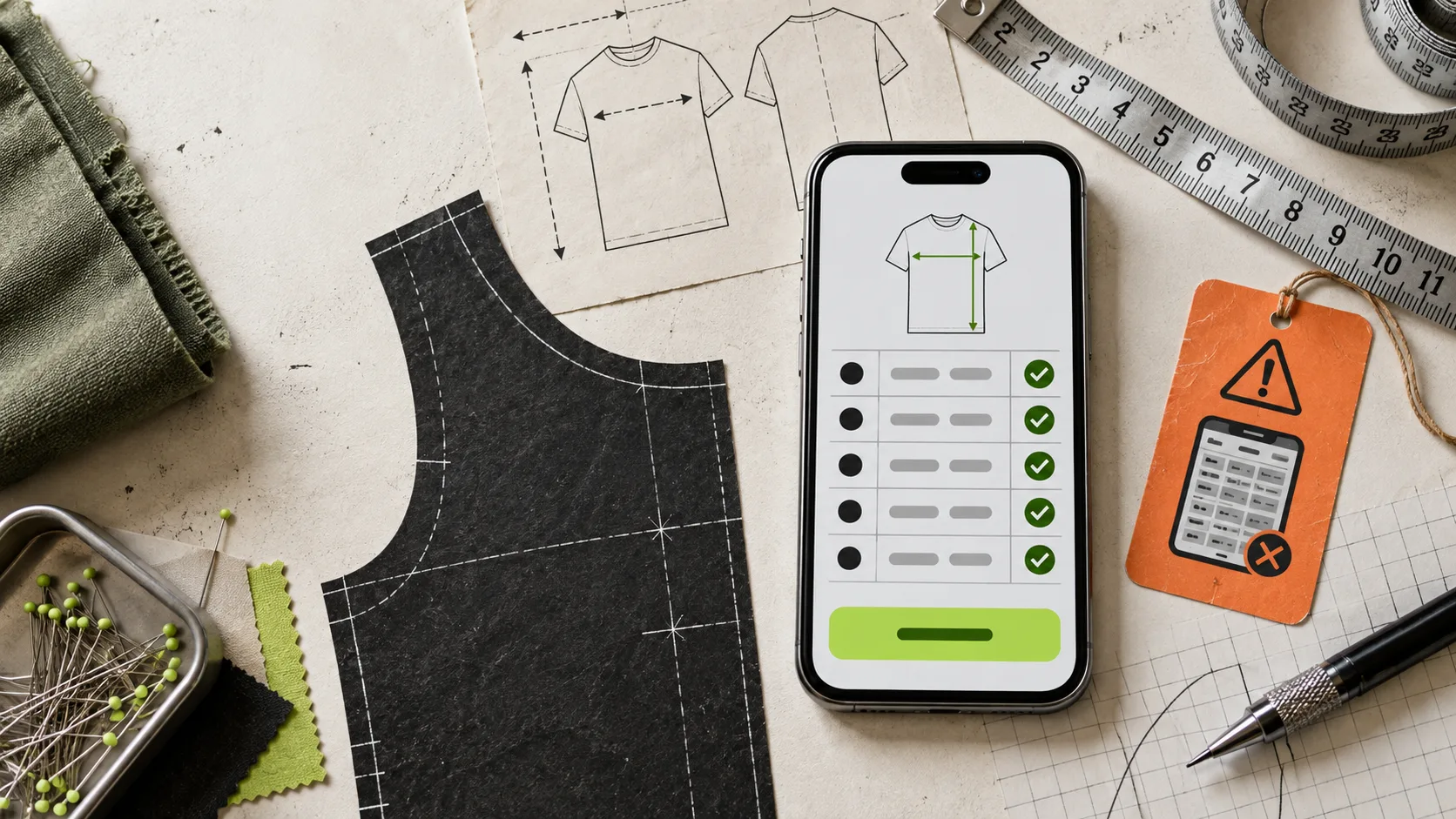
Most Shopify size charts fail on mobile for a boring reason: they were designed as desktop spreadsheets. A shopper arrives from Instagram, opens a product page with one hand, and meets a 10-column grid that is too small to scan, too wide to compare, and too vague to trust. At that point, the chart is technically present but practically absent.
The fix is not a prettier table. It is a mobile-first sizing decision: show only the measurements that help someone choose, explain where those measurements come from, and make the guide easy to open without losing their place on the product page. Here is a field-tested way to do it.
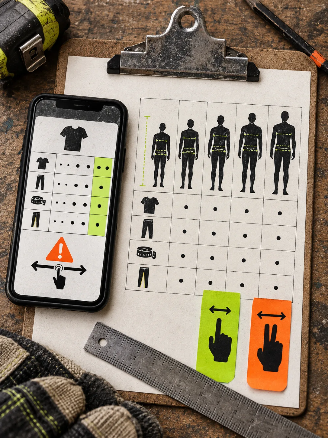
Start with the decision your shopper is making
A size chart is not an inventory sheet. Its job is to answer one question: which size should I buy? Before editing columns, pick the product family and the decision it requires.
For a relaxed-fit tee, shoppers may need chest width, length, and sleeve length. For footwear, they usually need a conversion from a known regional size plus foot length. For a belt, the useful measure is the distance to the holes, not a generic S/M/L label. This is why a single master table often becomes unreadable: it tries to serve products with different fit decisions.
Split charts when the garment construction or sizing logic changes. Keep a shared chart when the measurements and fit notes are genuinely interchangeable. If you are setting up a broader catalog system, this guide to building Shopify size charts for apparel, footwear, and accessories is a useful starting map.
Keep the first mobile view ruthlessly small
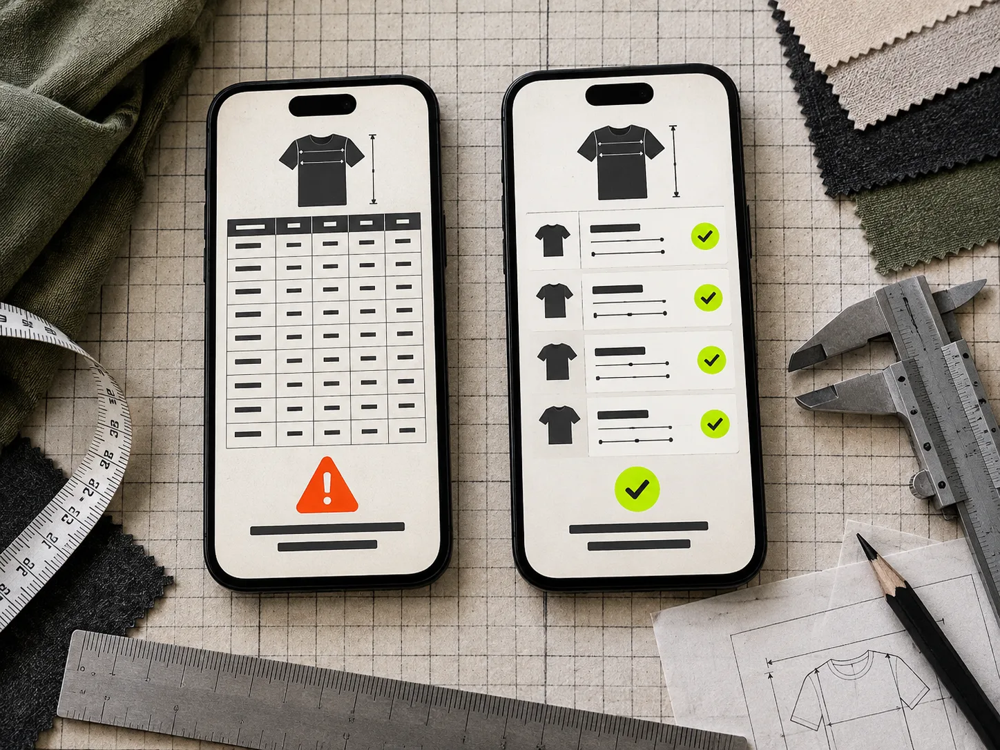
On a phone, aim for three or four essential columns. A reliable apparel pattern is: Size, Chest, Length, and a short fit note. Put secondary dimensions behind an expandable detail or a second chart only if they change the purchase decision.
Do not compress six measurements into tiny type just to avoid a second interaction. A shopper can tap an accordion; they cannot accurately read a table that demands sideways scrolling and two-finger zoom. If your chart must scroll horizontally, freeze the Size column and make the scroll cue obvious. Then test it on an actual phone, not only in a desktop browser’s device preview.
Use labels that match the way the garment was measured. Say “Garment chest, laid flat” rather than merely “Chest” when that distinction matters. And do not mix garment measurements with body measurements in the same unlabeled grid. That is how a confident-looking table creates a wrong-size order.
Give the numbers a measurement guide
A row of centimetres is only helpful when the shopper knows where to put the tape measure. Pair the chart with a simple labelled silhouette or photo-style guide. The guide should identify the exact locations you use in the table: chest, waist, inseam, rise, sleeve, or total length.
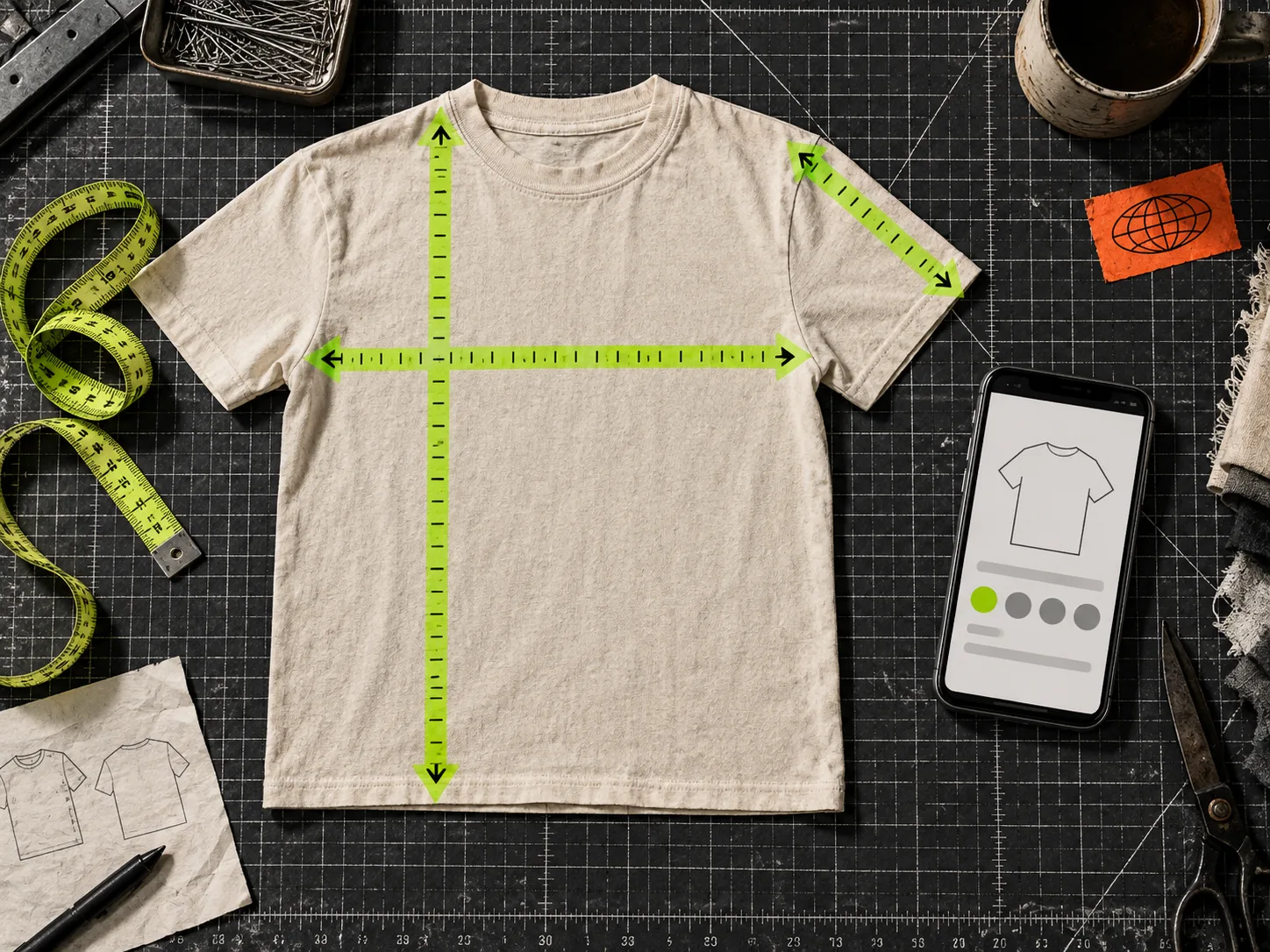
Keep the instructions short: “Lay a similar garment flat and measure under the arms” is more actionable than a paragraph about fit philosophy. Add one caveat where needed, such as allowing for a small manual-measurement variation.
This does more than make the page feel polished. It makes the chart comparable to an item the shopper already owns. That is much easier than asking someone to translate an unfamiliar body measurement into a garment size while standing in a hallway.
Choose the display mode by product-page context
Inline charts work well when sizing is the main objection and the table is compact. An accordion is a good default when the product page already has dense materials, care, and delivery information. A modal can keep a complex guide readable, but make the trigger plain, place it close to the size selector, and check that it is easy to close with a thumb.
The important rule: the guide should appear where a shopper decides, not somewhere below the reviews. If the purchase path starts with variant selection, the size-chart trigger belongs beside it. You can use the same product-page discipline when organizing Shopify product content with tabs and accordions; information architecture should reduce hesitation, not hide it.
Make units and fit notes do useful work
International stores should offer metric and imperial units when the chart supports a clean conversion. Do not force a customer who thinks in inches to do mental arithmetic while deciding between sizes. Keep the unit label visible at the column level, not in a footnote.
Fit notes deserve their own small, consistent language. For example: “relaxed fit; choose your usual size” or “slim fit; compare chest measurement before sizing up.” These are illustrative patterns, not promises—test them against the garment and your support team’s real questions.
If you are still pasting these notes into individual descriptions, that is a maintenance problem waiting to happen. A centralized size-chart system lets you create the chart once, reuse a measurement guide, and assign it by product, collection, product type, vendor, or tag. That is the practical advantage of Supra Size Chart: charts are managed centrally, rendered through a theme app block, and stored as Shopify metaobjects you can export as CSV or JSON.
Run a five-minute mobile QA before publishing
Open the product page on a real phone and check these items:
- Can you find the size guide without scrolling past the size selector?
- Can you read each default column without zooming?
- Is the unit visible and does the toggle behave as expected?
- Does the measurement guide use the same labels as the table?
- Does the correct chart appear for a product newly added to the relevant collection or tag?
- Can you return to the product page without losing the chosen variant?
That fifth check matters for a growing catalog. Assignment rules should cover new products automatically rather than making someone remember a second task after every launch. For a more detailed catalog-level audit, see how to audit Shopify size charts by fit family before launch.
Build once, then keep the source of truth clean
When a chart needs an update, you should change it in one place—not find and edit dozens of product descriptions. Keep a central chart, a reusable measurement guide, and explicit assignment rules. Export a CSV or JSON copy before a large seasonal change so your sizing data remains portable.
This is also a sensible place to separate product information from product media. A clear size guide answers a fit question; a good product image answers a material or silhouette question. If you are planning both, this Shopify product photo shot-list workflow helps keep the jobs distinct.
The next action is simple: choose one high-traffic product, open its size chart on your phone, and remove one column or instruction that does not directly help a shopper choose. Then rebuild the chart around that decision. A free Supra Size Chart setup gives you a clean way to apply that improvement across the catalog without turning every product page into its own maintenance project.