
How to Keep Shopify Swatches Consistent on Product and Collection Pages
A practical QA workflow for matching Shopify swatches across product pages, linked products, variants, and collection grids.

A swatch is a small interface element carrying a surprisingly large promise: this option is the same thing everywhere shoppers encounter it. The promise breaks when a product page uses tidy color circles, a linked-product group uses mismatched image chips, and a collection grid shows no useful choice at all. The shopper has to re-learn the catalog on every page.
The fix is not more swatches. It is one deliberate swatch system, checked in every surface where a shopper makes a choice. Here is the practical workflow I would use before asking a theme developer to touch anything.
1. Decide what a swatch represents
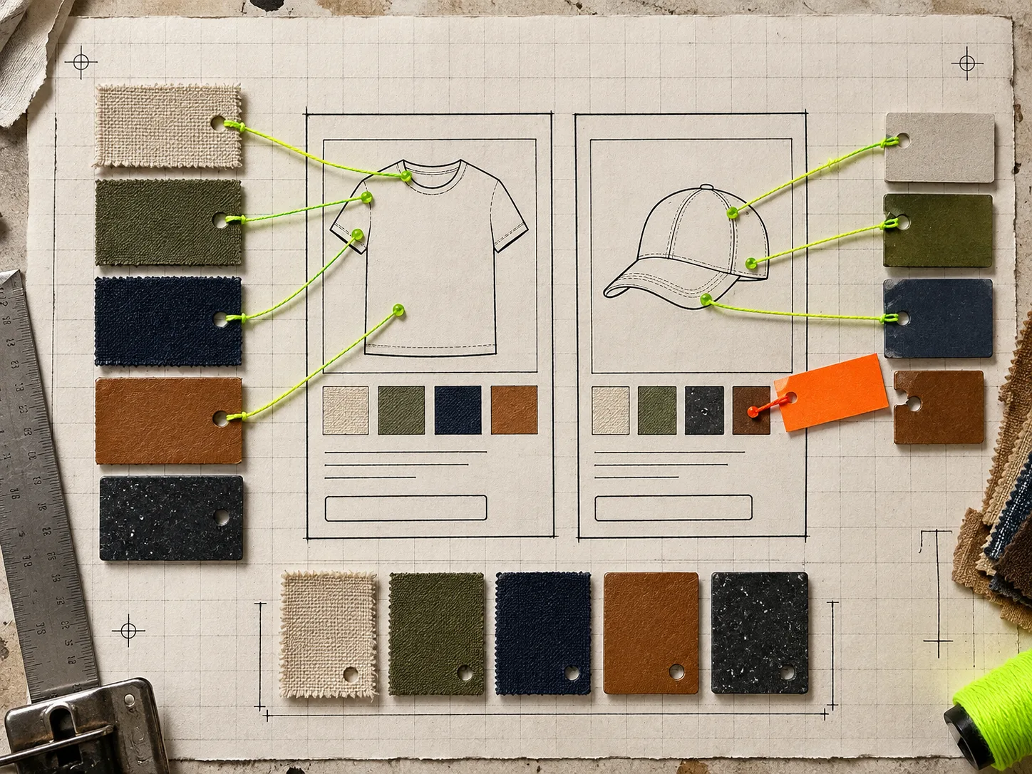
Start with the question that prevents most cleanup later: does a chip select a variant, or does it take someone to a different product?
Use a variant swatch when the options share one product page and the same basic product. Use linked-product swatches when each colorway, material, or style deserves its own page, photos, description, or inventory story. Mixing those meanings inside one group makes a catalog feel unreliable even when the buttons technically work.
Write down one source of truth for each option: its customer-facing name, whether it is a color or image swatch, and the destination it should select. This is the same kind of small preflight that makes a Shopify size-chart audit useful: find the exceptions before customers do.
2. Build the visual language before configuring it
Pick the rules once, then repeat them. For example:
- Solid colors get color chips; textures, patterns, and finishes get image swatches.
- The selected state must be obvious without relying only on color.
- A swatch name and tooltip should use the same plain-language term as the product option.
- Similar shades need a visible boundary or label so navy, ink, and black are not just three dark dots.
Supra Swatch Colors is useful here because it supports both color and image swatches, variant options and linked products, plus configurable shape, size, label, tooltip, and style. Its color detection and product-image setup can speed up the first pass, but do not let automation decide ambiguous colors for you. A product photograph can make a better chip than a hex value when the material, print, or wash is the real decision.
This is also where many stores over-design. A tiny chip does not need to be a miniature ad. It needs to be recognisable, tappable, and consistent with its neighbouring choices.
3. Test the product page as the decision surface
On a product page, check the swatch group in the order a buyer would: can they see that choices exist, tell what each choice is, select one, and understand what changed?
For variant swatches, verify that the price, availability, media, and selected state follow the choice. For linked products, verify that every destination belongs to the intended group and that the active product is visibly current. Do this with the longest option names and the least photogenic materials, not only with the easiest demo SKU.
If image swatches are part of the plan, crop them for recognition at chip size. A full product image often becomes visual noise. The close crop should show the fabric, pattern, or finish that distinguishes the option. That is the operational lesson behind using product images as Shopify swatches: match the representation to the choice a shopper is actually making.
4. Treat collection-page swatches as a separate QA job
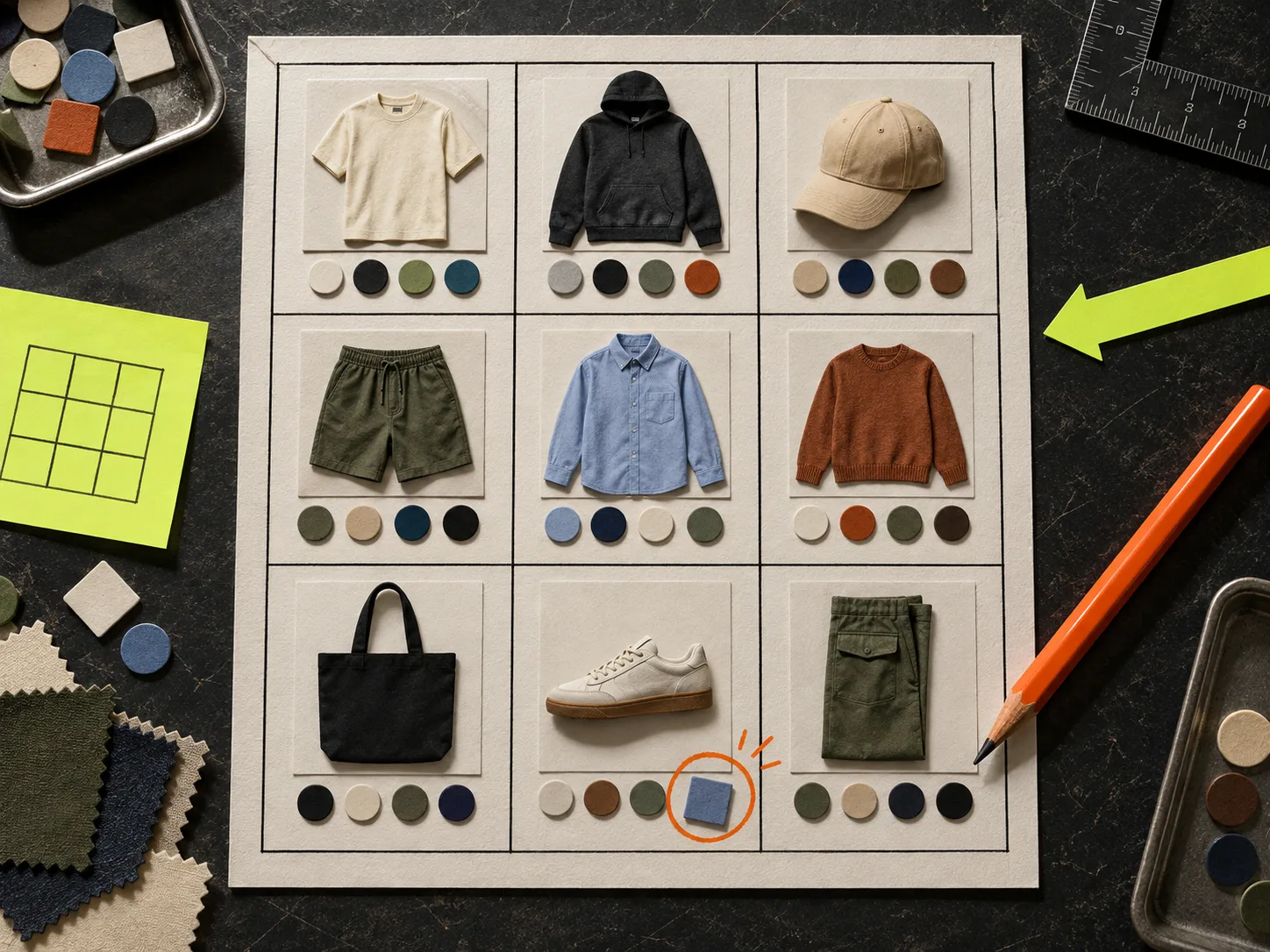
A collection page is not a smaller product page. It is a comparison surface, where shoppers scan many items, filter mentally, and decide which card deserves a click. A swatch that works well beside a full product gallery can become cluttered or misleading in a twelve-card grid.
Check these points in a real collection:
- Do the visible colors match the product-page choices for each item?
- Does choosing a swatch move to the expected variant or linked product?
- Are chips fast enough and compact enough that cards still scan cleanly?
- Do unavailable or missing options look intentionally handled rather than broken?
- Does the behaviour hold on a filtered collection and a collection with mixed product groups?
Supra Swatch Colors supports swatches on collection pages without code, but “no code” is not “no review.” The collection grid is where a bad group mapping becomes very public. For a useful companion checklist, see how to plan collection-page swatches before touching a Shopify theme.
5. Run one mobile pass before launch
Desktop hides many swatch problems: more horizontal room, more forgiving hover states, and fewer accidental taps. On a phone, test the smallest viewport you expect to support. Tap every chip with a thumb, confirm the selected state has enough contrast, and make sure image chips do not crop away the useful detail. Open a collection card, change a selection, go back, and confirm the catalog still feels coherent.

This is also the right moment to inspect multilingual storefronts. If the shop serves more than one language, a tooltip or option label that stays in the default language can make an otherwise polished implementation feel unfinished. The app supports multilingual shops, but your actual options, translations, and naming convention still need a human check.
6. Keep the system maintainable
Do not make every new product a special case. Keep a short swatch worksheet for new items: group name, linked products or variants, swatch type, source image or color, and the collections where it must appear. Reuse it during launches and seasonal refreshes. The same habit keeps other storefront automation manageable; this guide to preserving review control in Shopify blog automation makes the broader case for simple, reviewable source material.
For large catalogs, start with one representative group: a solid color, a patterned option, a linked-product family, and a collection with enough products to expose density problems. Once those four pass, you have a real pattern to replicate instead of a fragile one-off.
The practical next step
Open one high-traffic collection and one corresponding product group. List every visible option, then compare the name, swatch treatment, destination, and selected state side by side. Fix the disagreement first. If you need a system that can handle variants, linked products, image swatches, and collection pages from the same toolkit, install Supra Swatch Colors and configure your first representative group before expanding it across the catalog.