
How to Test Shopify Swatches Before an International Color Launch
A practical pre-launch test for Shopify color swatches: labels, selected state, product media, collection cards, and multilingual catalog checks.
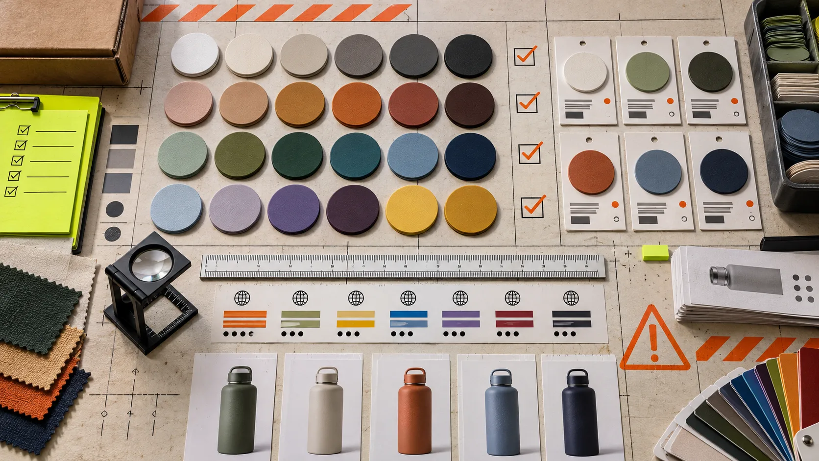
A color launch can look finished in the Shopify admin and still fail on the storefront. A swatch may select the wrong variant, leave the old product image in place, or show a label that makes sense only in one language. Those are small mismatches until a customer is choosing between four near-identical colors on a phone.
The fix is a short storefront test before the collection goes live. The goal is not to inspect every SKU by hand; it is to test the places where a color choice changes meaning. This is the field test I would run for a new or internationalized catalog.
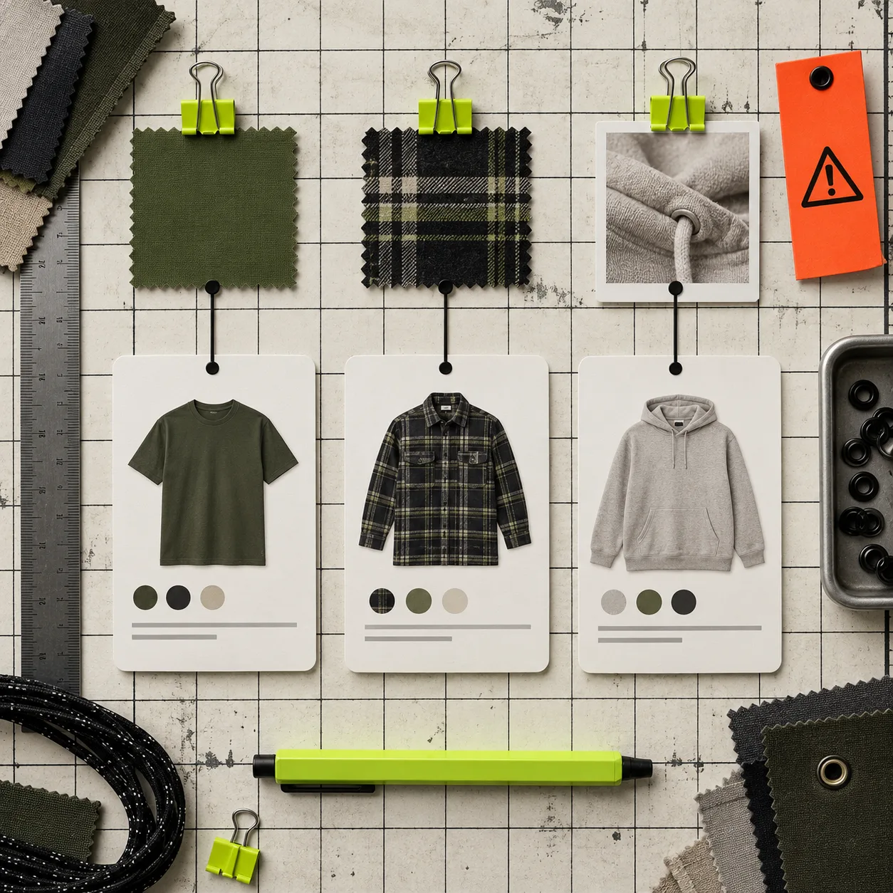
Start with one representative product set
Pick three products, not thirty:
- A product with standard color variants.
- A product where each color is a separate product page.
- A product with image swatches or unusually similar shades.
That sample reveals most configuration mistakes without turning QA into an inventory project. Write down the expected result for each swatch: selected color name, URL or variant, price, media, availability, and collection-card behavior. Shopify’s own variant guidance is useful here: when a shopper chooses a variant, the page should update the product media, price, and selector state together (Shopify variant documentation).
For the swatch layer, Supra Swatch Colors is practical because it can turn existing color variants into swatches or link separate product pages, and it supports product and collection pages without theme-code work. The choice is still yours: use a variant when inventory and options belong on one product; use linked products when each color needs its own page, media, or merchandising story.
Test the swatch itself before testing the grid
Open each sample product in an incognito window and ask a blunt question: can a shopper tell what this control will do before tapping it? Check the visible label, tooltip, size, contrast, and selected outline. Do not rely on the color chip alone for “Sand,” “Oat,” “Bone,” and “Ivory.” Those shades may be distinct in the studio but not on every display.
Then select every swatch and confirm five things:
- the chosen state is unmistakable;
- the color name matches the selected product or variant;
- the product image and price change when they should;
- an unavailable option is not presented as buyable;
- a copied product URL returns to the same selected choice.
If labels are the weak point, this earlier swatch-label audit is a good narrower pass. The important thing is to test the public storefront, not just the editor preview.
Make the visual source match the product promise
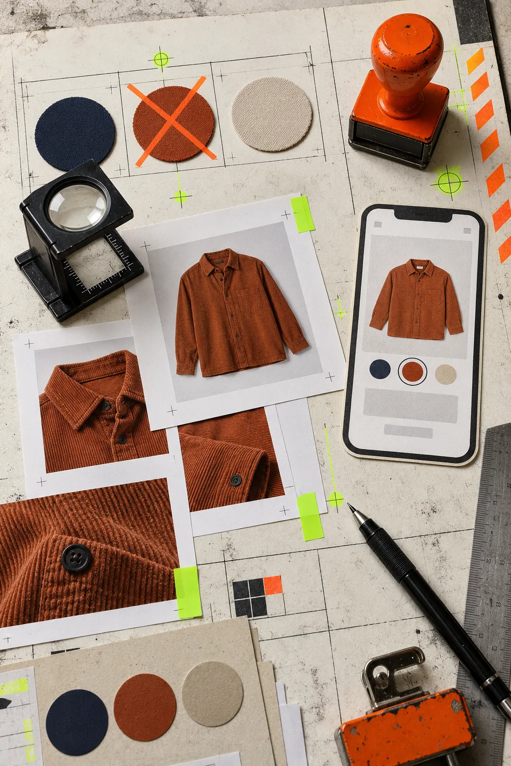
A color chip is fast to scan; an image swatch is often better when texture, print, or finish matters. But image swatches introduce a new failure mode: the small thumbnail can imply a different product than the main media. Compare every swatch image with the landing image after selection. If a shopper picks olive and sees a generic cream photo for a beat, the interface feels unreliable even if the cart is technically correct.
Use product-image swatches only when the source image stays recognizable at a tiny size. Otherwise use a consistent chip and let the product media do the explanatory work. For more on that decision, see how product images can work as Shopify swatches.
Repeat the test in each storefront language
International QA is not a translation exercise. Switch the storefront language and inspect the same three products. Look for labels that overflow, hard-coded color names, inconsistent capitalization, and tooltips that are still in the default language. Also test currency and product availability if those change by market.
Keep a small exception list rather than redesigning your entire catalog. A translated color label that needs a shorter form is a content task. A swatch that leads to a product with the wrong price is a launch blocker. Treat those differently.
Check the collection page last
Collection swatches are where a tidy product-page setup can become noisy. On desktop and mobile, open a filtered collection, scan several cards, and tap a swatch near the middle and bottom of the list. Check that the interaction takes shoppers to the intended variant or linked product, does not reset filters unexpectedly, and still makes sense after lazy-loaded cards appear.
This is also where a consistent system pays off. Our product-and-collection swatch guide covers the cross-surface setup; this collection browsing guide is useful when the grid itself is the shopping decision.
Use a launch gate, not a perfect-catalog fantasy
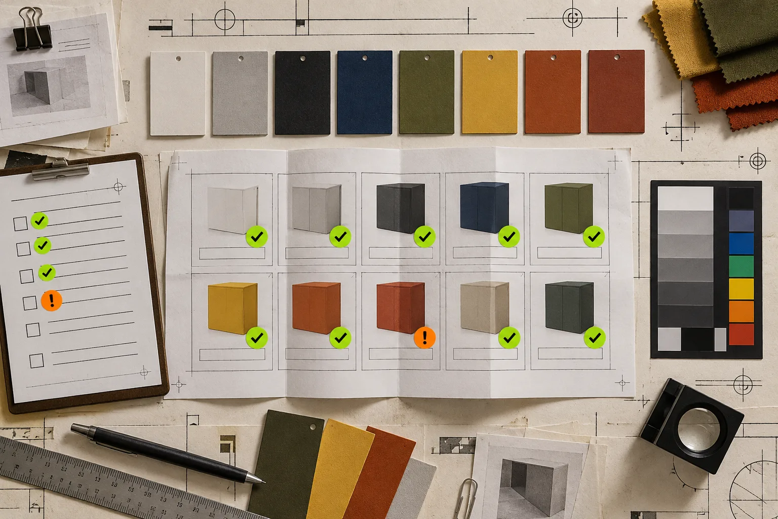
Before publishing, save screenshots of your three sample products in each target language and one collection view on mobile. If the label, selected state, media, price, and destination all agree, you have evidence that the setup is ready. If they do not, fix the single broken layer and retest that path.
Start the swatch setup in Supra Swatch Colors, then run this sample-based audit before expanding it across the catalog. It is faster than answering “which blue did I buy?” support messages after launch.