
How to Choose Shopify Swatches That Match the Product, Not Just the Variant
A practical method for choosing Shopify color and image swatches that help shoppers recognize products and browse collections with confidence.
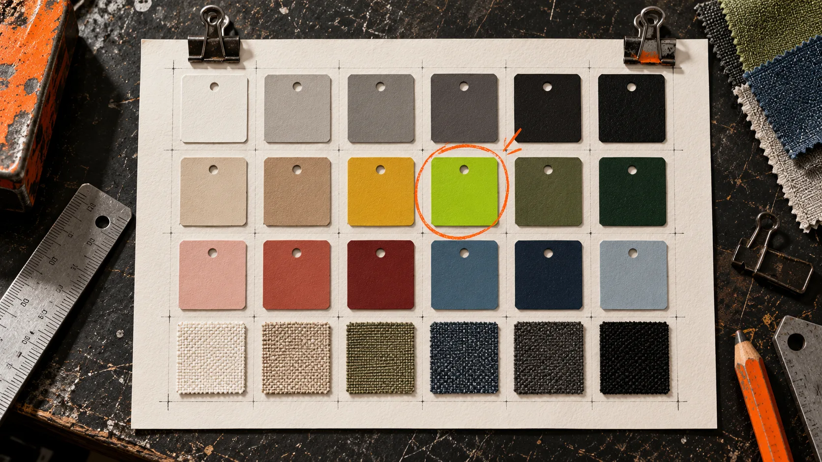
A swatch is a tiny promise: click this, and the product you get will look like that. Break the promise and shoppers hesitate, open extra tabs, or assume a color is unavailable.
The common mistake is treating swatches as a cosmetic variant setting. For apparel, home goods, cosmetics, and anything with materials, the better question is: what visual cue helps a shopper identify this option before they read the label?
That distinction decides whether a plain color chip, an image swatch, or a linked product is the right tool. This guide is a practical way to make that choice, then check it where people actually browse.

Start with the shopper’s evidence
Before opening a Shopify app, collect the three things a customer can use to distinguish an option:
- The material or finish. A solid cotton tee can usually live with a color chip. Heathered knit, marble, wood grain, patterned fabric, and metallic finishes often cannot.
- The product relationship. Is navy merely one variant of the same SKU, or is it a separate product page with different photography, inventory, copy, or fit?
- The browsing context. On a collection page, a shopper sees a compressed card. The swatch must communicate quickly without asking them to decode a long option name.
Make a small source sheet for each product family: approved color name, a material sample or product crop, and the destination product/variant. It sounds fussy, but it prevents the particularly expensive error of assigning one generic brown circle to camel leather, walnut veneer, and cocoa fabric.
Choose the swatch type deliberately
Use a color swatch when the difference is truly a single, stable color and the product image does not add useful information. This is the fastest route for conventional variants such as black, white, red, or a tightly controlled brand palette.
Use an image swatch when texture, print, wash, or finish changes the buying decision. A small crop of the actual material can explain more than a hex code ever will. Keep the crop consistent across a product group: similar scale, lighting, and border treatment.
Use a linked-product swatch when each colorway deserves its own page. This is useful when a color has its own photographs, merchandising story, inventory, or URL. The shopper gets the clarity of a color picker while you retain separate product pages behind it.
Supra Swatch Colors supports variant color options and linked products, plus color and image swatches on both product and collection pages. It also lets you tune size, labels, tooltips, and style without rewriting theme code. That flexibility is useful only after the source material is honest.
Build one reference set before touching the theme
Do not make color decisions while configuring fields. Gather your source material first, then normalize it. A simple sequence works:
- Pull the approved product images or material samples from the same source your merchandising team uses.
- Name colors for people, not internal inventory shorthand. “Moss Green” beats “GRN-07” in a tooltip.
- Decide whether two near-neighbors are distinguishable at swatch size. If not, rely on an image crop, label, or a clearer product photo.
- Record which products belong in the same visual family, especially when separate pages should be connected.
This is related to testing before a broad store change: our guide to testing a Shopify tag cleanup before applying it storewide uses the same small-pilot discipline. Pick one representative product family, prove the rule, then roll it out.
Configure for recognition, not decoration
A swatch should be easy to compare and hard to misread. In your settings, keep the treatment stable across a family: same chip size, shape, border, label behavior, and order. If you need an outline so white and cream chips do not disappear, use it for all light chips.
Then configure the collection-card version as seriously as the product-page version. A customer filtering a collection is often making the first color decision there. Supra Swatch Colors can display swatches on collection pages without code, so inspect how many appear, how they wrap, and whether the selected state is obvious.
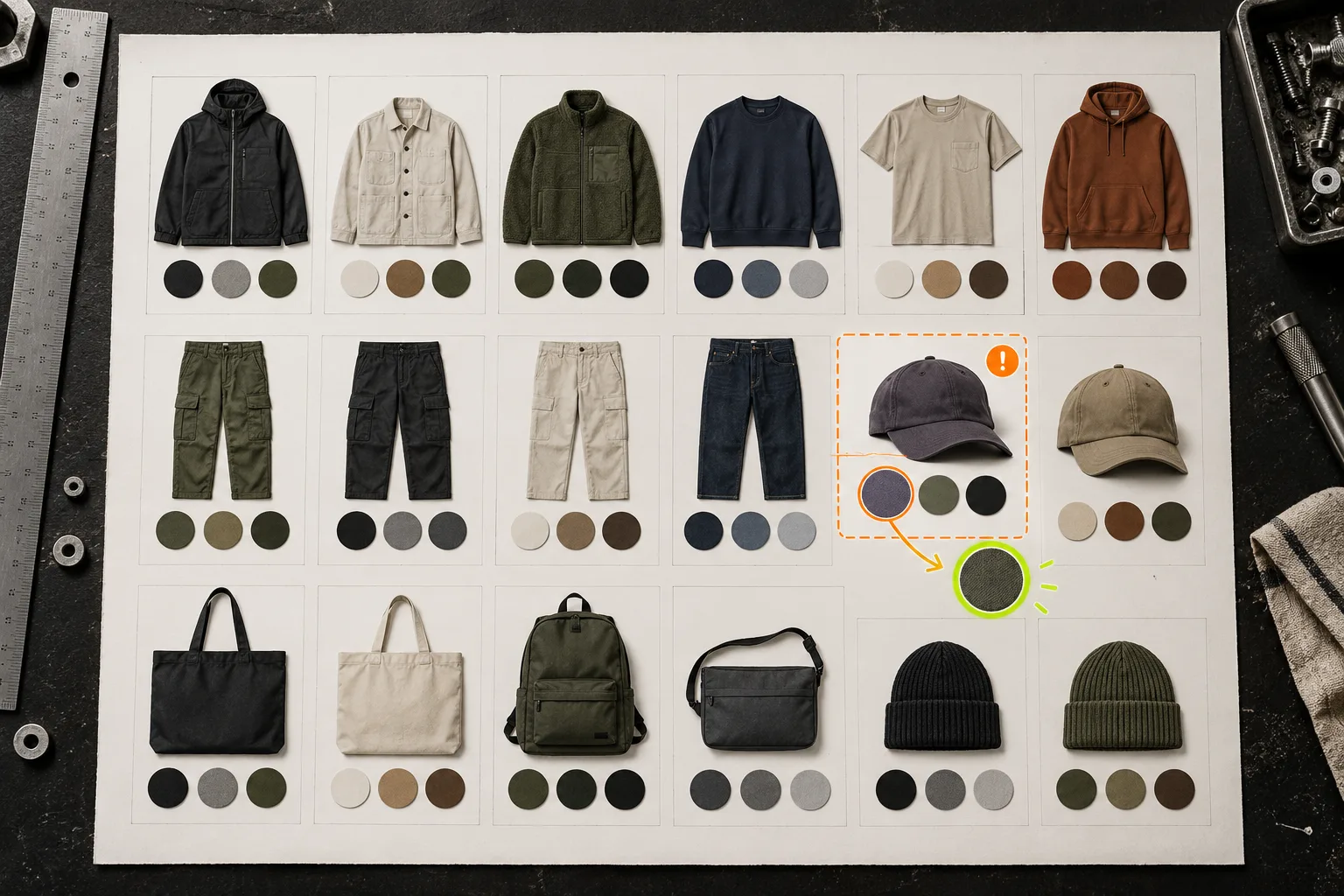
The failure mode here is visual noise: twelve tiny circles, no labels, and no sense of what is selected. Reduce the number shown if necessary, preserve a clear active state, and make the card image change only when it adds real confirmation.
For a deeper collection-page check, compare this setup against how to choose your first Shopify products for 3D models. The medium is different, but the underlying habit is useful: choose a small, representative set before standardizing a visual treatment across the catalog.
Run a five-minute reality check
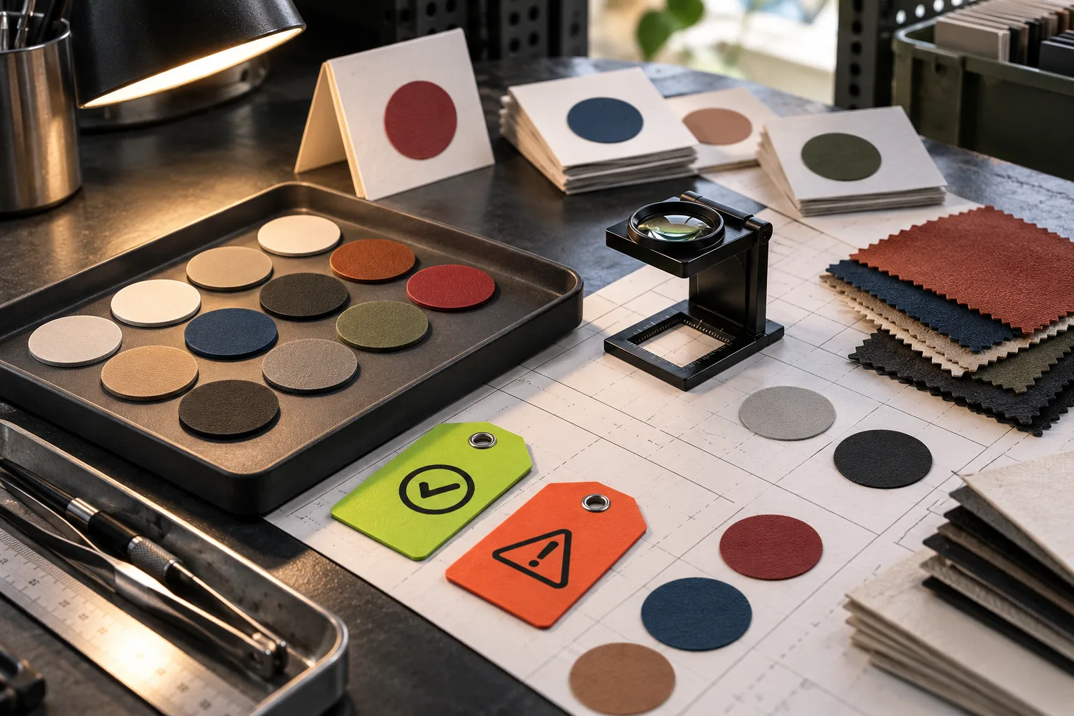
Open the storefront in a private browser window and test one product page plus one collection page on desktop and mobile. Check these questions:
- Can you identify the option from the swatch alone?
- Does the label or tooltip remove ambiguity for similar colors?
- Does selecting a swatch update the expected variant or linked product?
- Do light, dark, patterned, and image-based swatches still have enough contrast?
- Are the same colors represented consistently on the collection card and product page?
- Does the treatment remain understandable for multilingual shoppers?
International stores need an additional pass: translated option names may change length, while visual color cues often travel better than abbreviations. If you are expanding a palette across regions, pair this with the method in how to test Shopify swatches before an international color launch.
Keep product groups manageable
Once the first family works, document the rule in one sentence: for example, “use image swatches for textured finishes; link products when photography or inventory differs.” That sentence gives the next person a decision rule rather than a pile of one-off settings.
If the catalog includes sizing as well as color variation, keep the systems separate but coherent. A shopper should not have to guess whether a color click changes the product, the size availability, or both. Our guide to mapping product types to Shopify size-chart rules is a useful companion when those option systems meet on the same product page.
The practical next step
Choose one high-traffic product family and make a source sheet for it today. Decide what each option needs to communicate, configure the appropriate swatch type, and test it on the collection page before cloning the pattern.
If you want the mechanics to stay out of the way, install Supra Swatch Colors from the Shopify App Store. Its variant, linked-product, image, multilingual, and collection-page support gives you the tools; the source sheet makes sure shoppers see the right story.
A well-chosen swatch does not merely make a product page prettier. It makes the next click feel safe.